Joon’s mission was clear: bring the rich, unique taste of a centuries-old family pistachio recipe to American fingertips. Our challenge was to build a brand that feels fresh and relevant for today’s consumers while honoring its distinctive heritage.
— What We Did
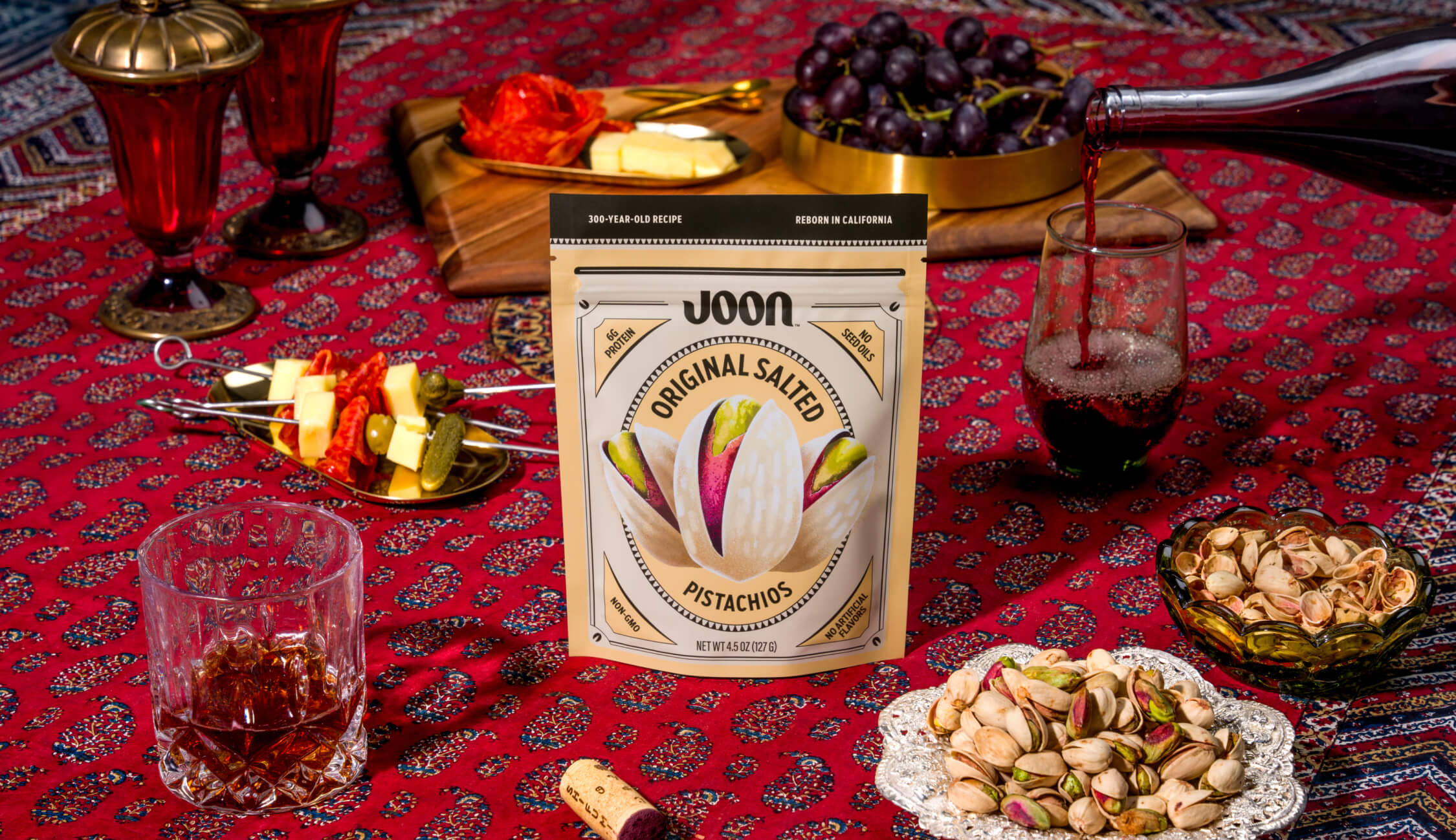
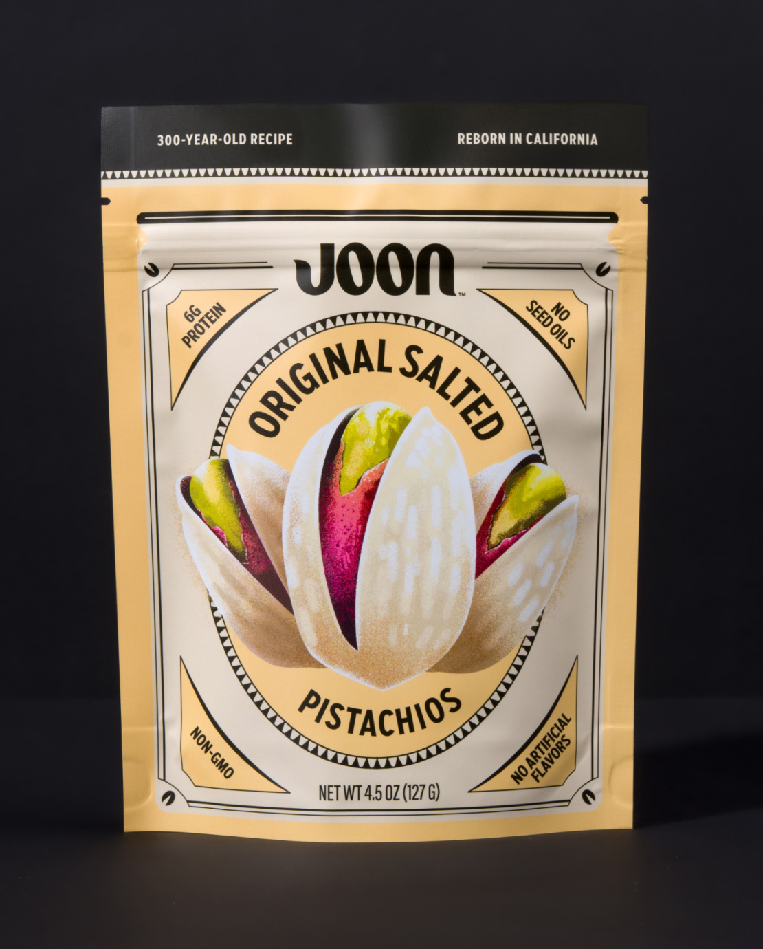
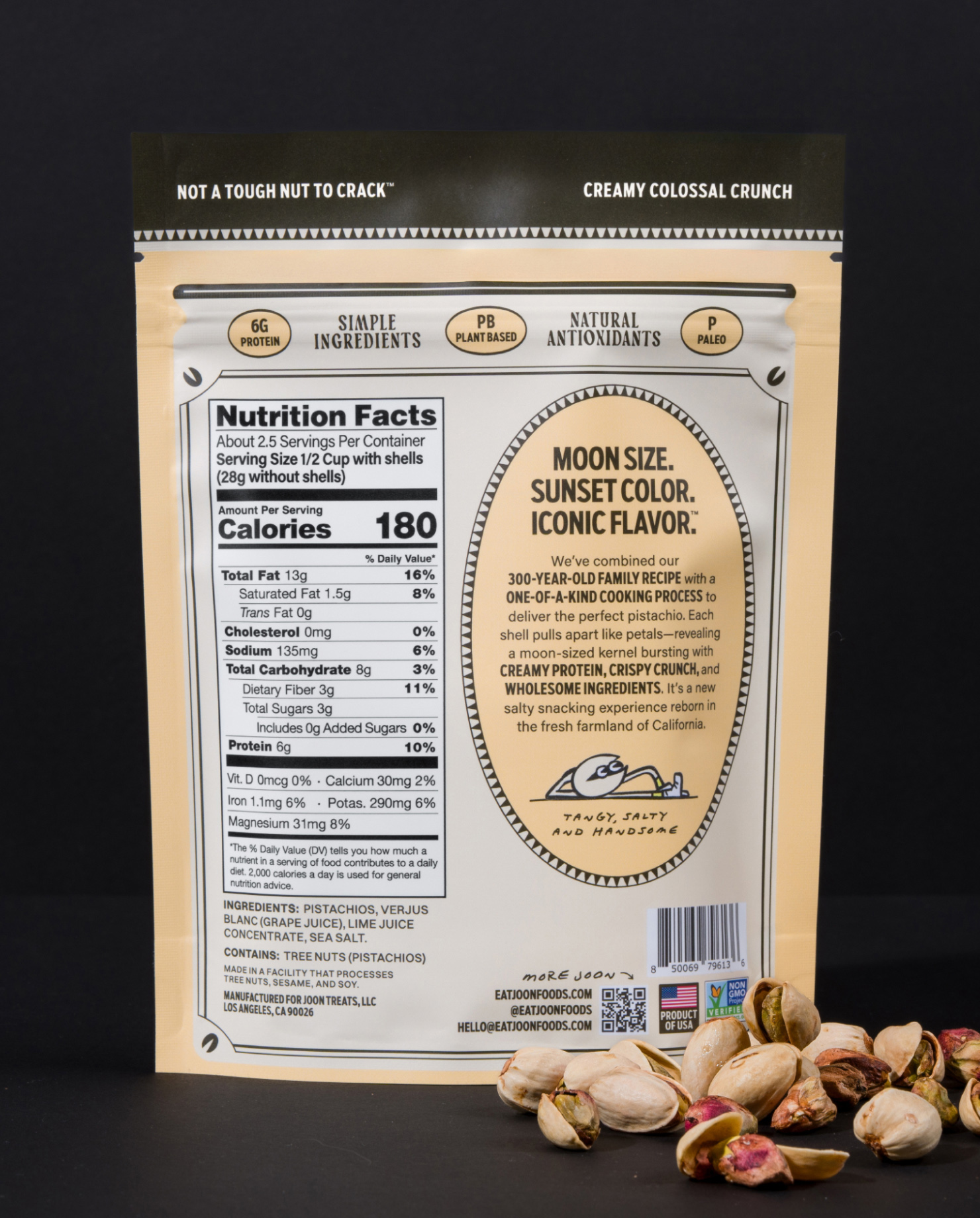
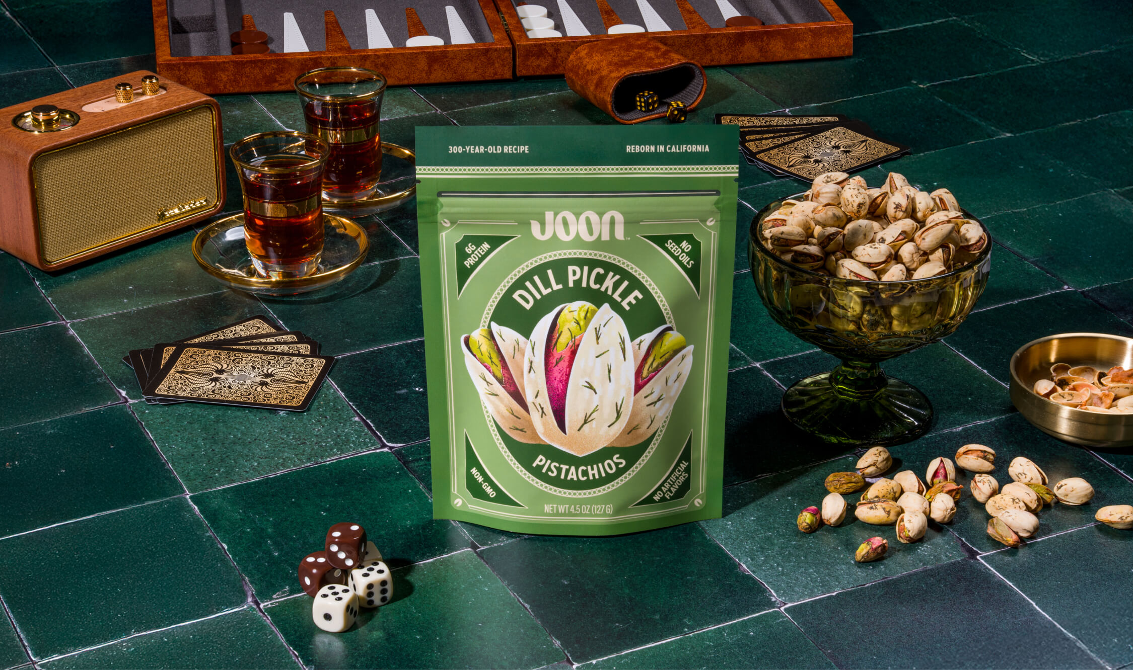
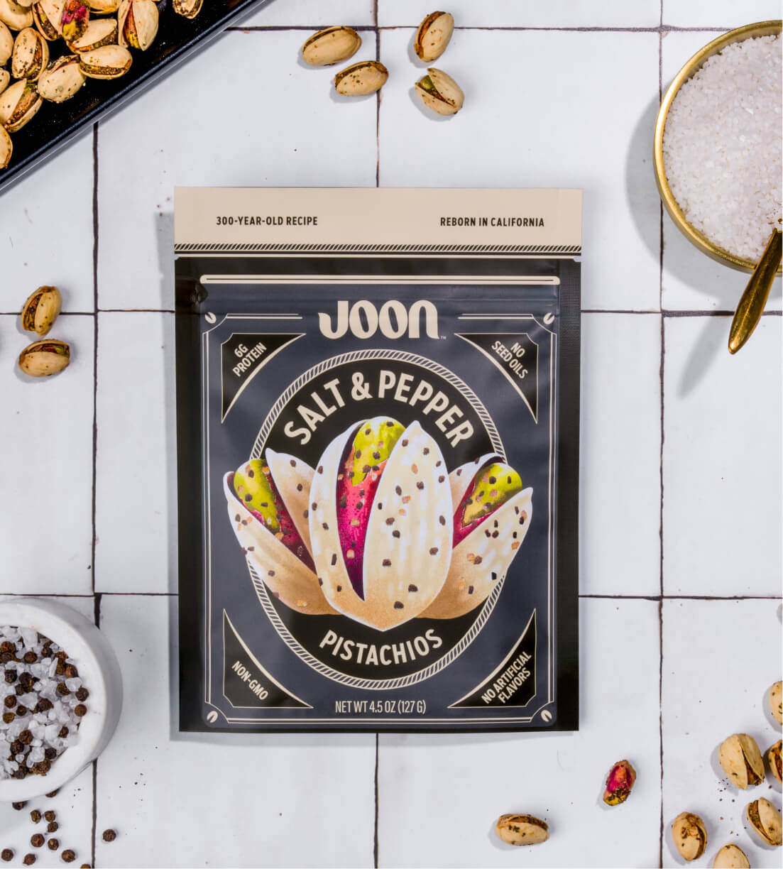
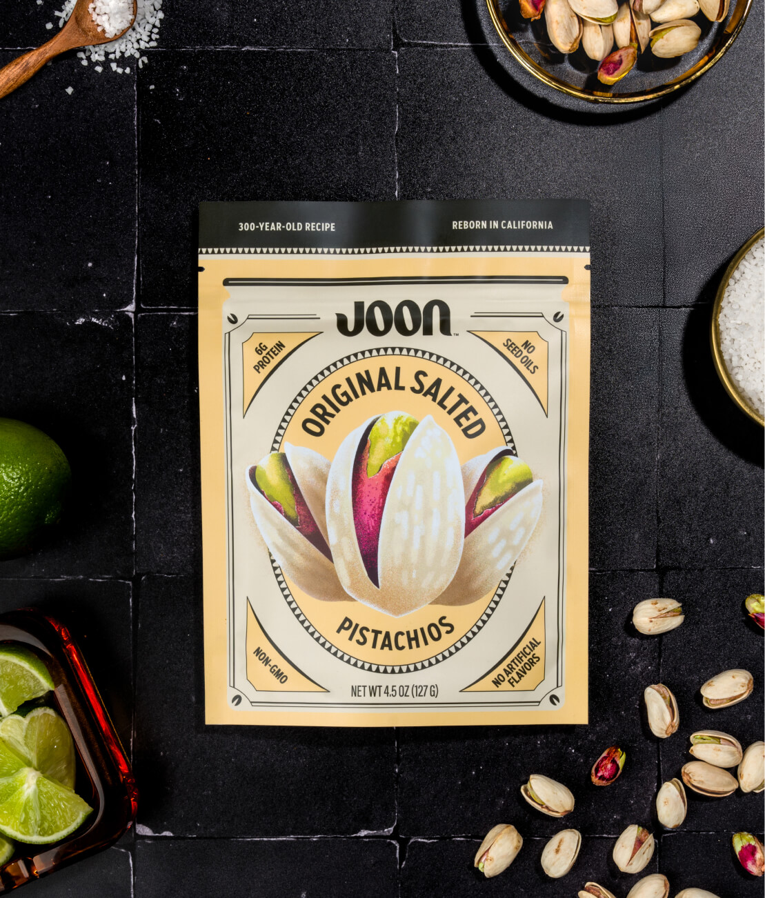
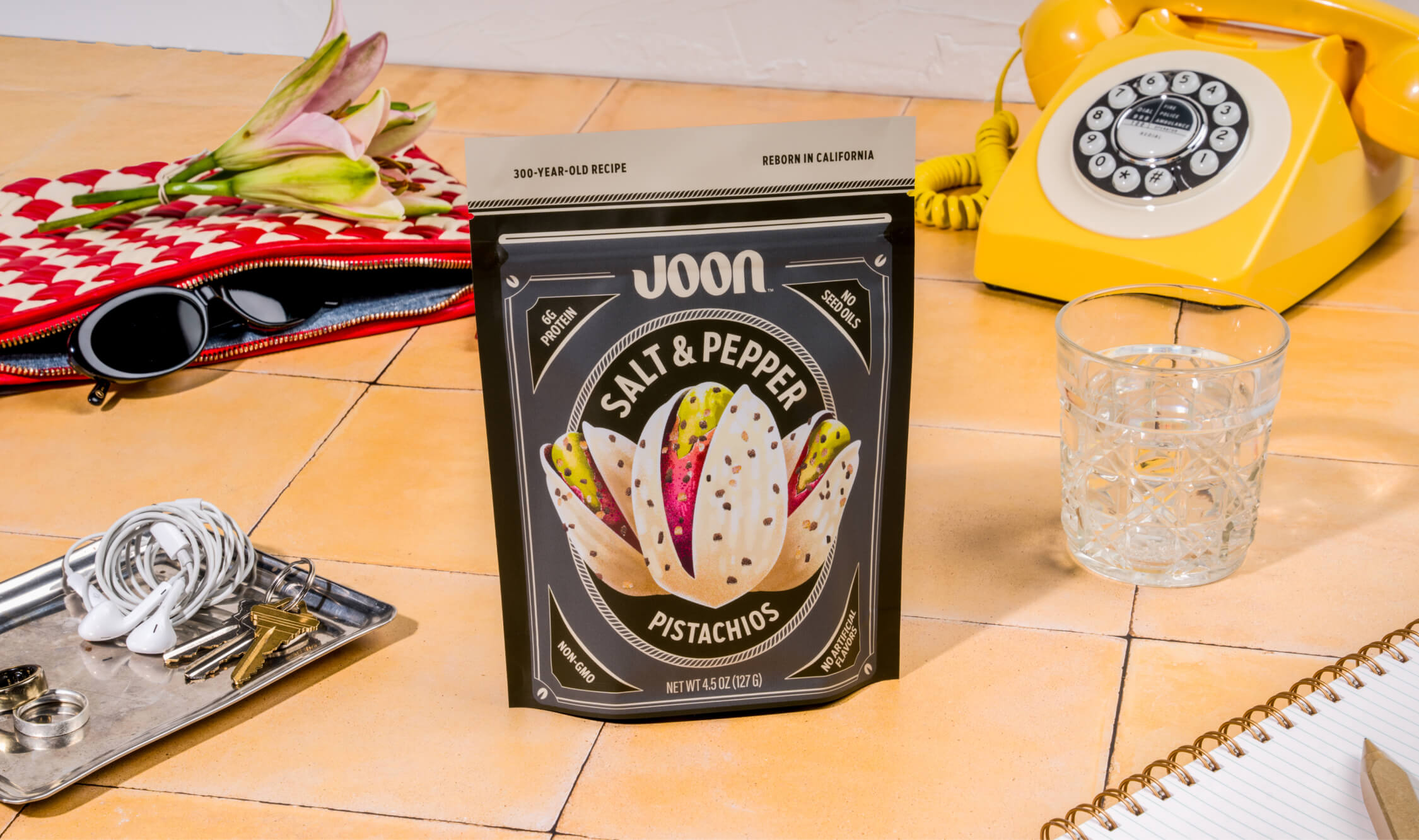
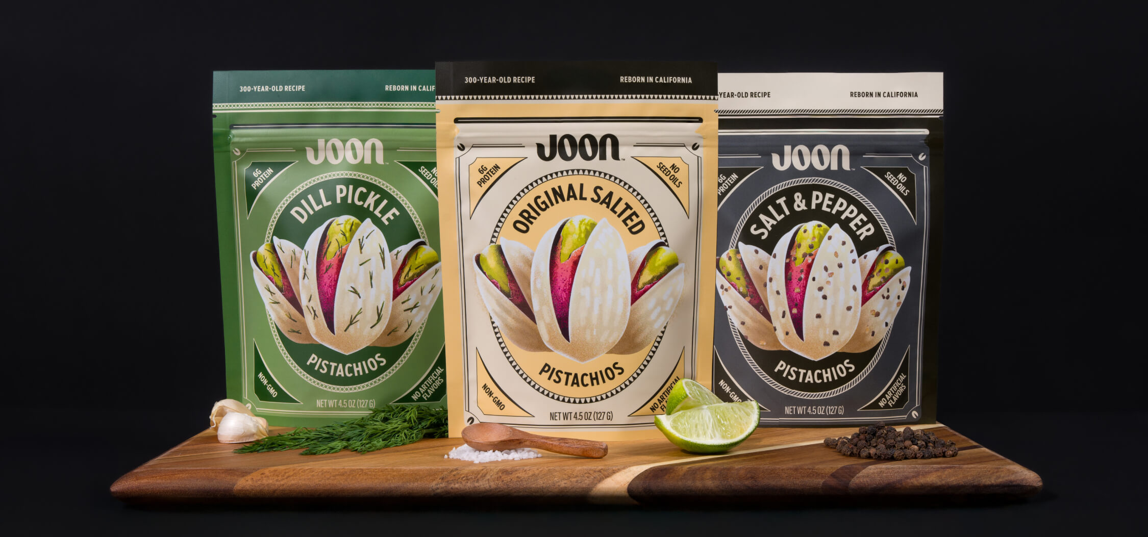
Joon grows and brines moon-sized pistachios with unbelievable color, crunch, and tang. They’re free of artificial flavors, grown in California-clean soil, and super easy to peel. Made from a treasured family recipe, Joon needed to immediately stand out as a bold new offering on shelves crowded with ordinary snacks.
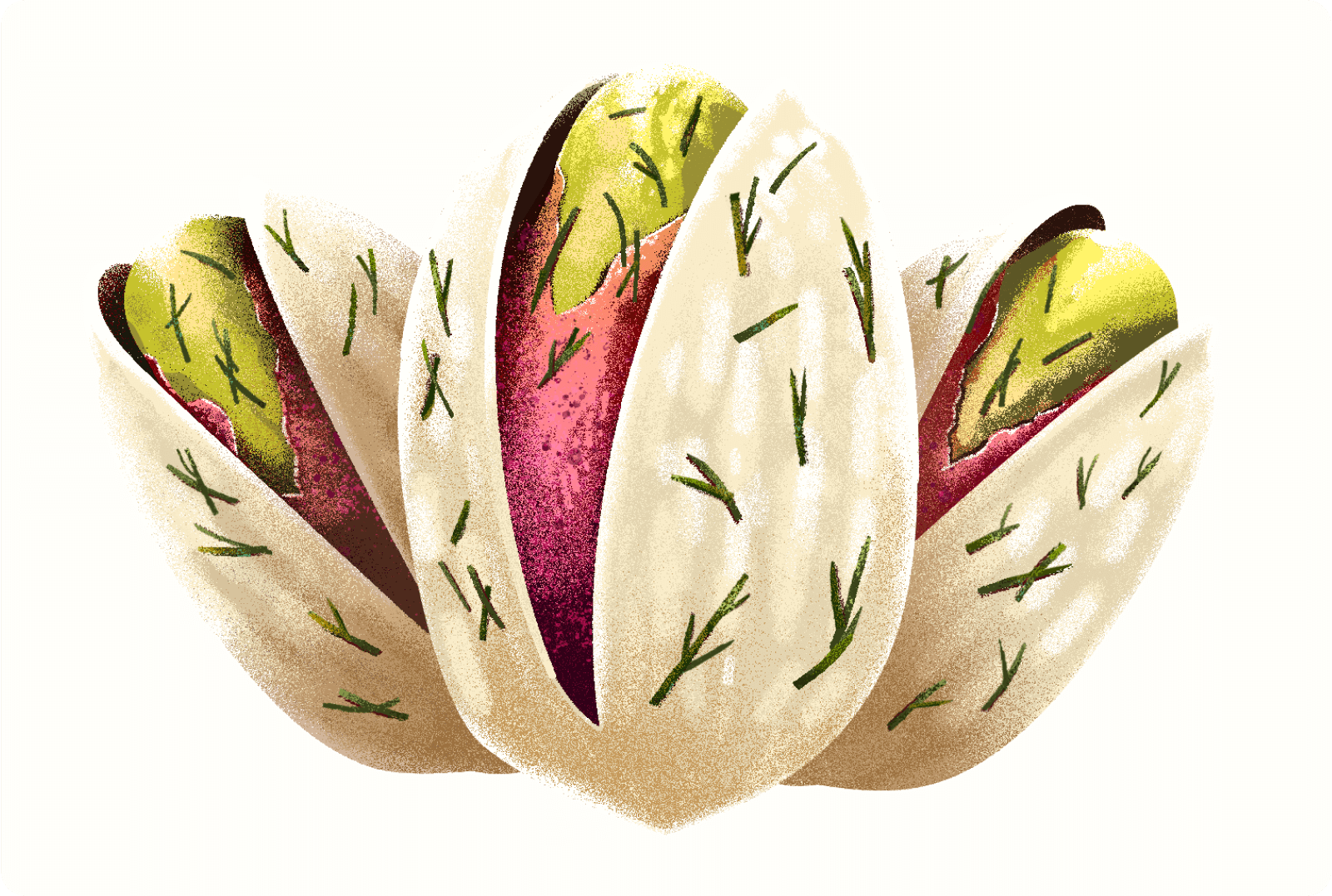
Graphic elements frame the pistachios like a vintage portrait, nodding to the family history as if to say: “These aren’t dusty bodega snacks, child.” Each flavor has a unique pattern throughout the designs: Middle Eastern flair meets modern clean aesthetic.
Tension is struck between romance and reality, old world and new, serious ingredients and playful personality. Every person who picks up a bag of Joon can taste a timeless tradition passed down between pistachio lovers.
— Project Partners
Design Collaboration: Paddy Gilligan
Illustration: Joshua Ariza
— Credit
Photography: Butter Creations